Solene
A family perfume house in Paris needed an identity as distinctive as a scent you remember — a wordmark you could recognise before you even read it.
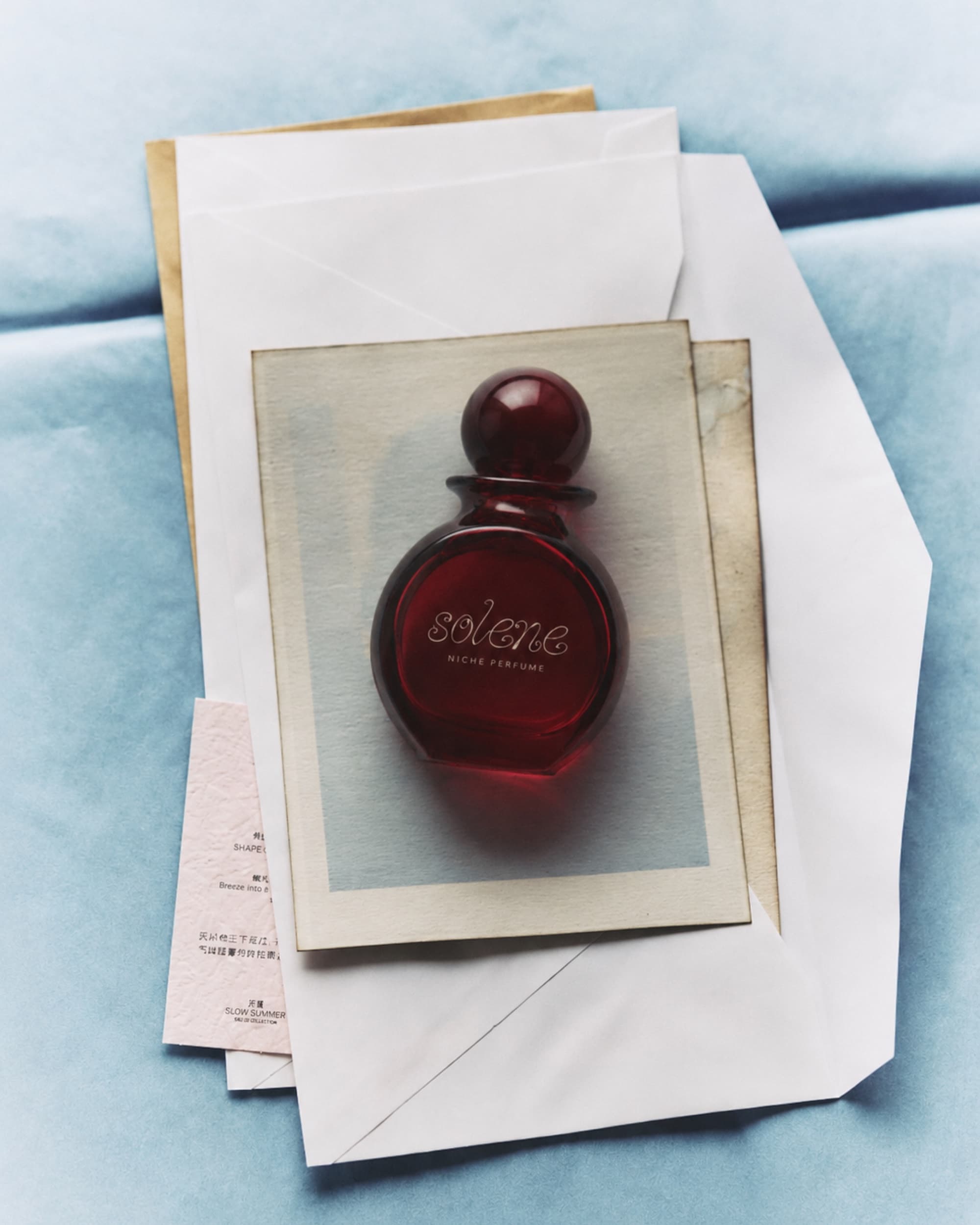
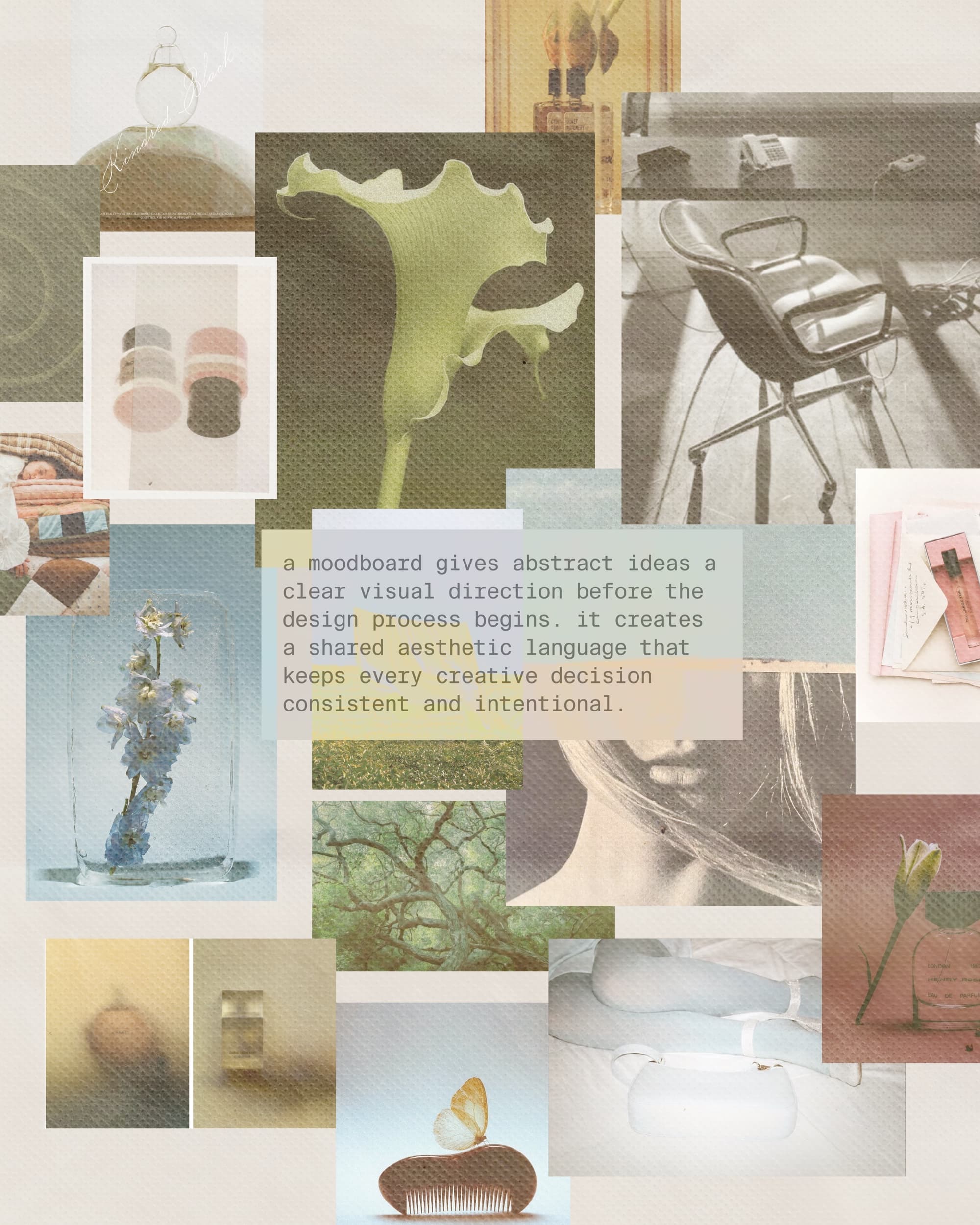
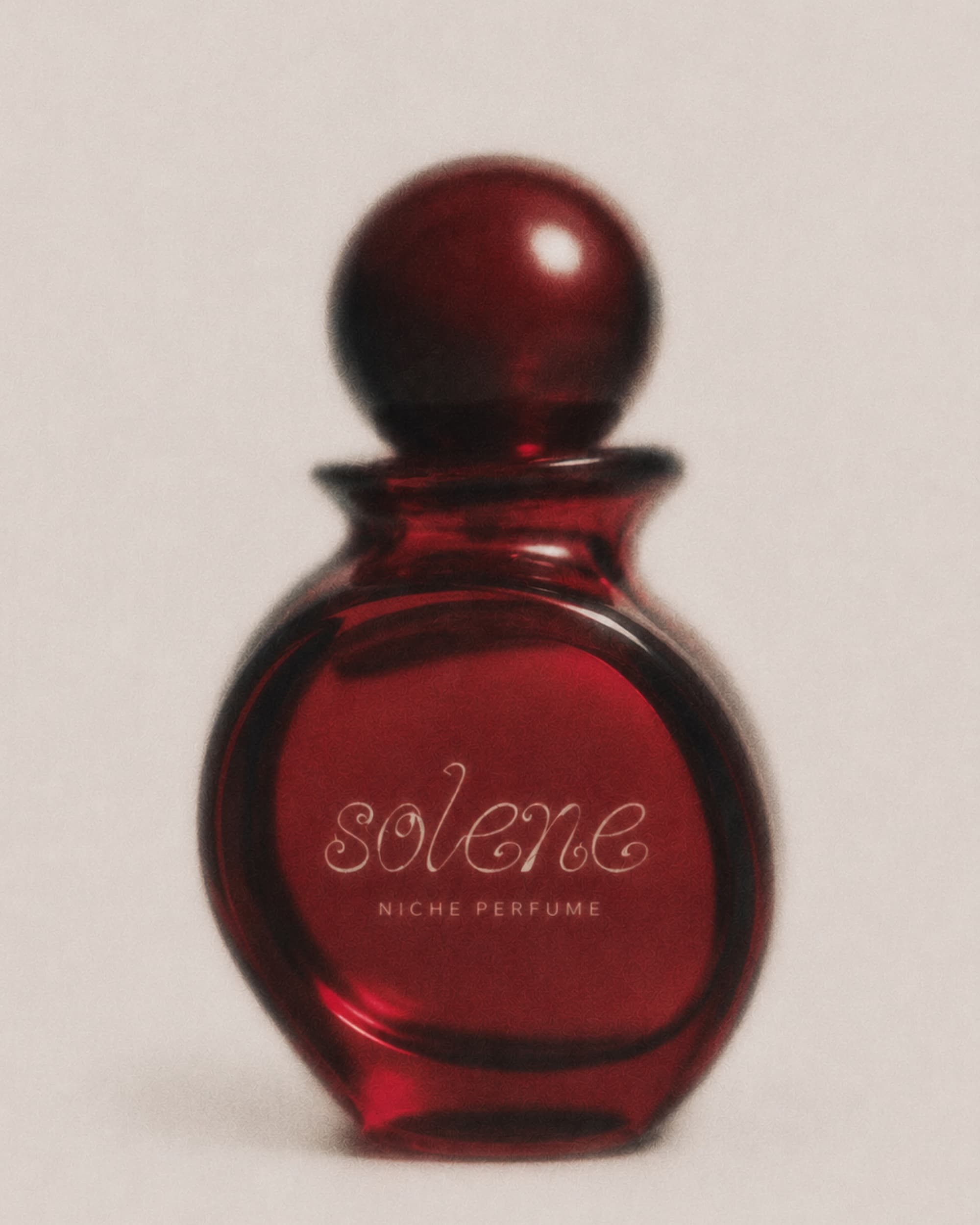
Solene is a niche French perfume brand — a family business launching in Paris. The category is crowded with houses that all hide behind the same restrained sans-serif labels and clinical glass. The family wanted the opposite: warmth, character, something clearly hand-made. The brand carries a name, so the identity had to feel personal — a signature rather than a logo, an object you'd want to keep on the shelf long after the bottle is empty.
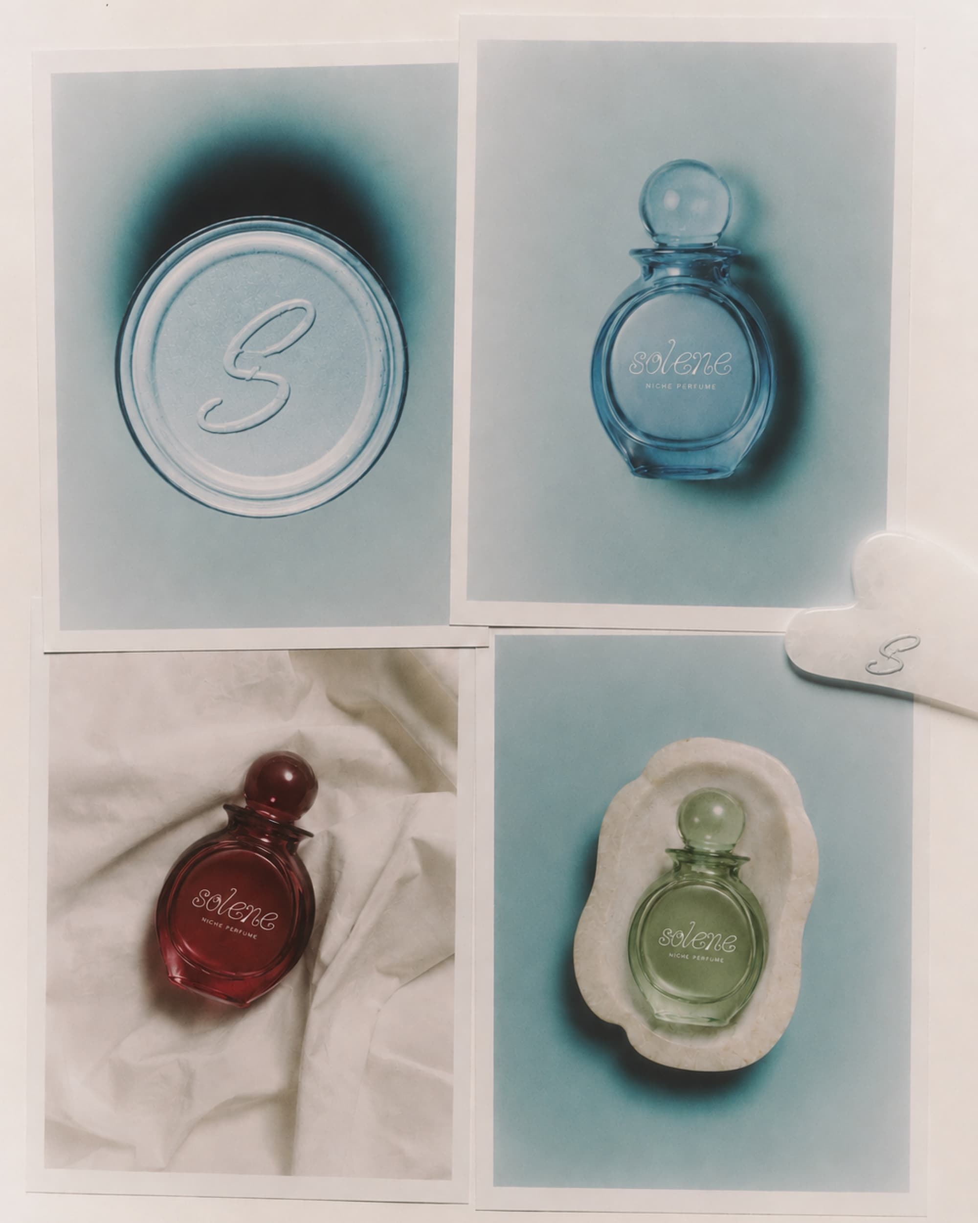
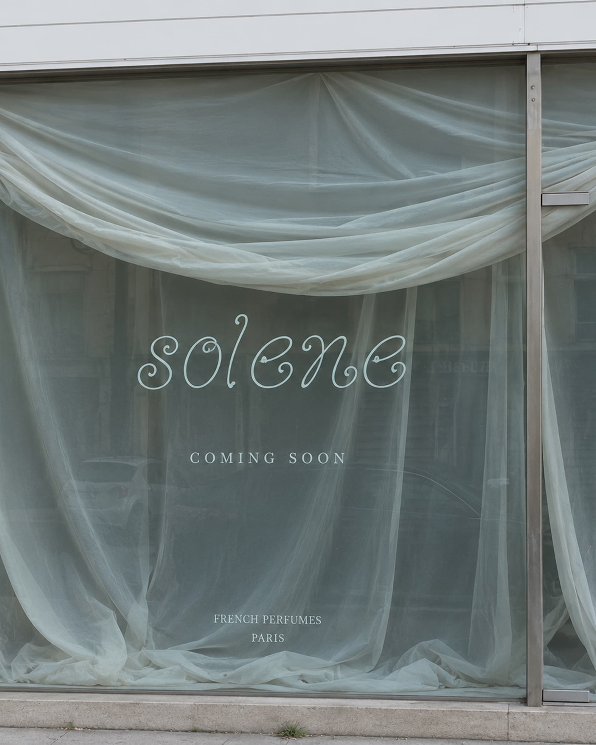
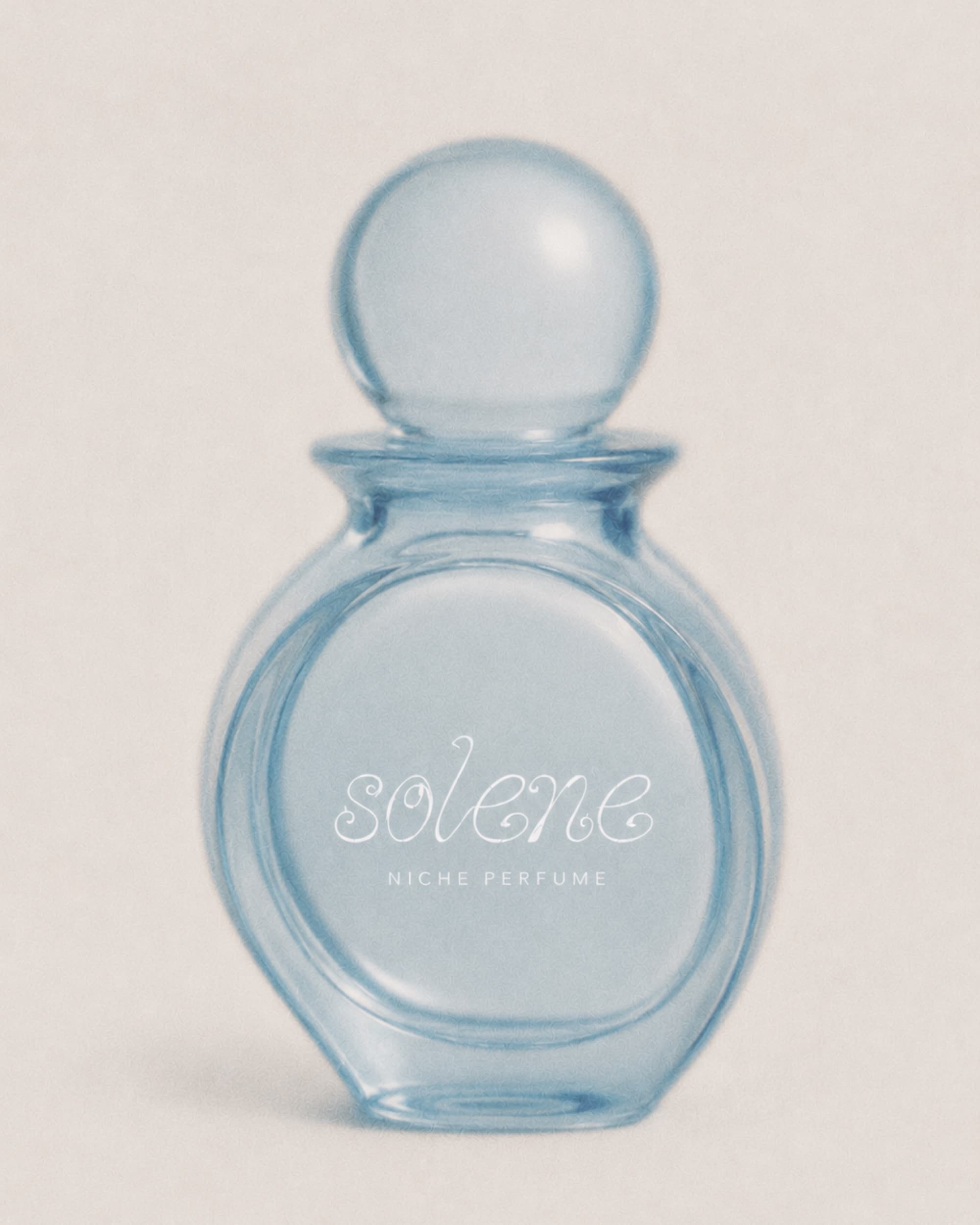
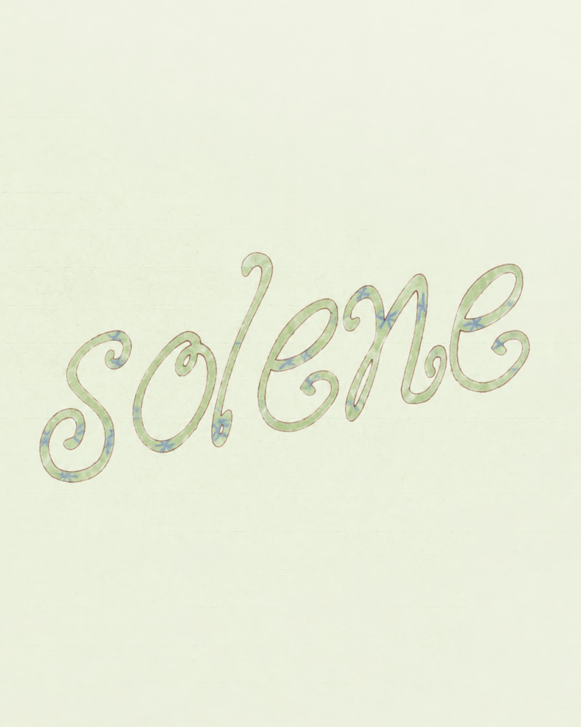
Everything started from the wordmark. I drew it by hand — curling cursive letterforms with looping terminals, built entirely custom so the name reads like a personal signature rather than a typeface. From it came an "S" monogram for seals, caps and embossing. The bottle is a rounded apothecary form with a sphere stopper, produced across a spectrum of translucent glass — deep red, soft blue, green, amber — so every scent owns its own colour. The photography was kept tactile and editorial: bottles on a vintage café table, nestled in tissue and old letters, a tulle-draped storefront on a Paris street. Soft, lived-in, unmistakably French.
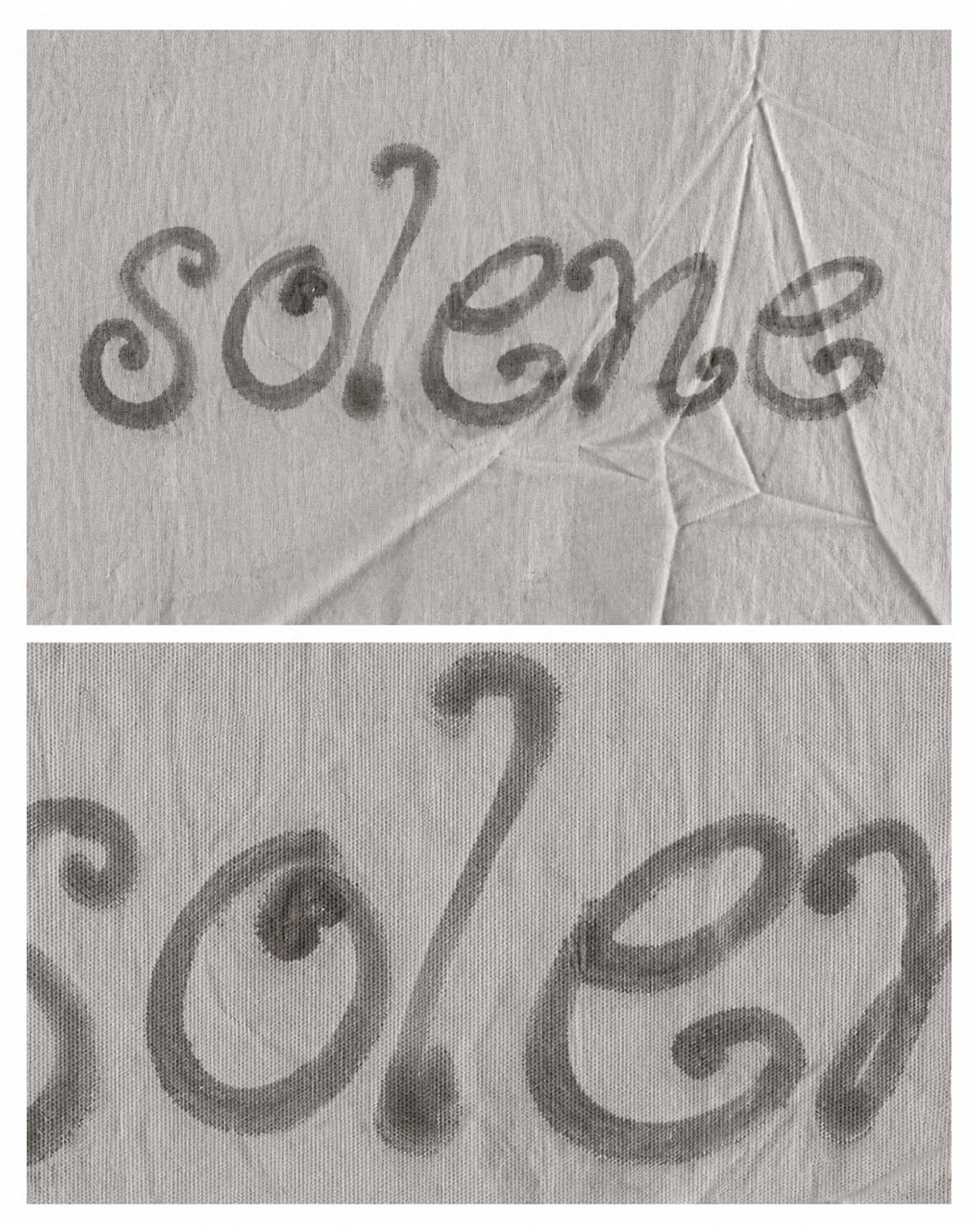
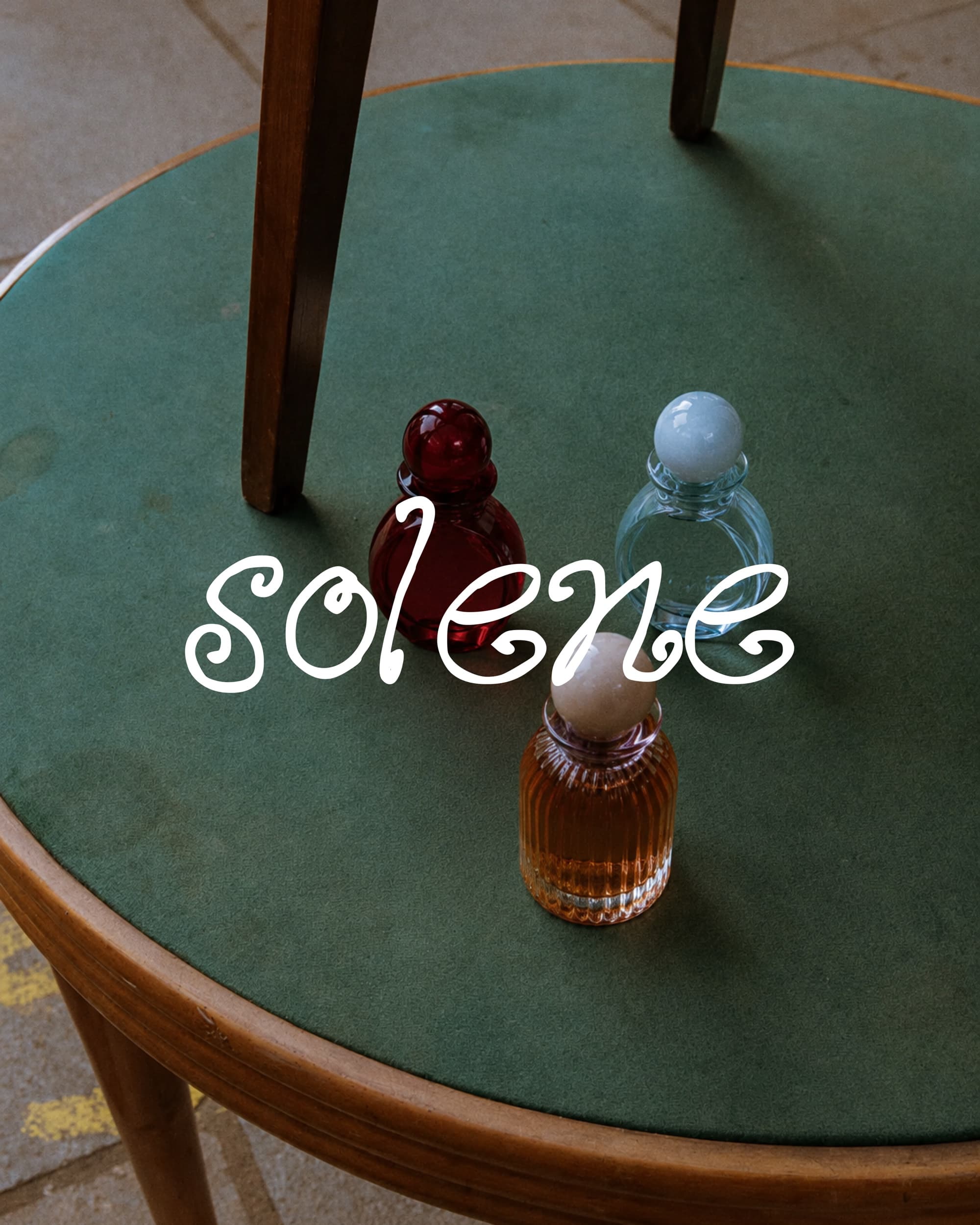
A complete brand identity for Solene: hand-drawn logotype, monogram, bottle and packaging design, a colour-coded glass system, and an art direction that runs across product shots, print and the Paris storefront. The full world of the brand — from the 1cm cap engraving to the shop window — speaks the same language.